Colors
Inspired by the meeting between human and machine

How machines sees human warmth
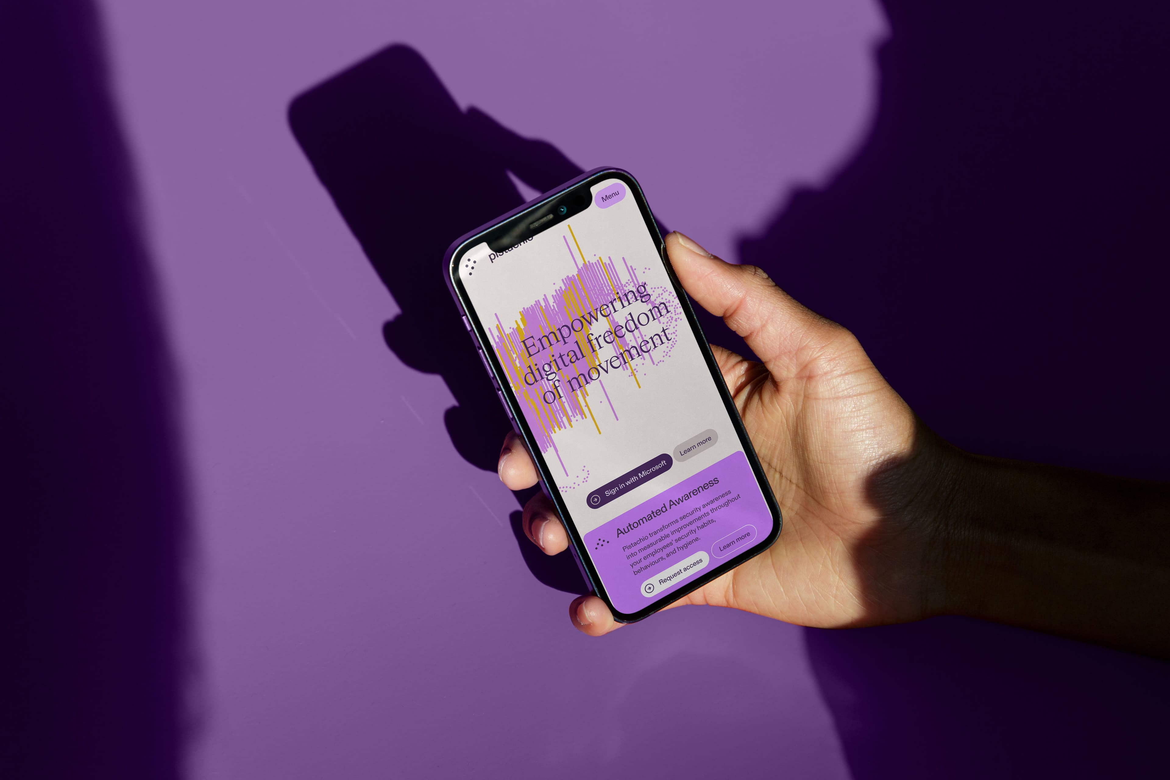
Building further on our reveal design concept, our color palette is inspired by infrared camera technology, designed to distinguish humans from inanimate objects. Our primary color is a vibrant purple with supporting colors from the infrared range, in combination with white and a soft, warm color that provides a gentle base for all our communication.
A Neutral Base
Warm
Black
White
Vivid Primaries
Our primary palette are what creates distinction in our color palette. Violet is to be considered our main color, with the remaining colors intended to enrich our visual expression, and thus be used more sparingly.
Violet 400
Tangerine 400
Solar 400
Slate 900
Hierarchy through elevation
By default we set the background of any surface to be Warm. This allows us to visually bring content forward by placing it on in a frame which has a white background. Things that are brighter are generally perceived as closer to us, and this helps us create a clear visual hierarchy.
Typically elements such as navigation, logo and metadata can be placed directly on the background, whereas the primary content should be wrapped in white.
Tokens
For theming, all colors in our palette have values ranging from 100 to 1000, where 100 is the brightest, near white, and 1000 is the darkest — near black.
Besides from warm and slate, 400 is considered the base of each color range. When theming (next section) make sure to use a satisfactory contrast in lightness and saturation.
Tokens are available in Figma and Github.

Theming
Our primary color scheme is warm-100, with neutral-100 to emphasize, and content in violet-1000, but in order to highlight content we use color theming, where we work with different values within the same color. The main thing to remember is to ensure sufficient contrast between background, buttons and text. See examples below.
Theming Examples