Layout & Examples
Through a few key attributes, our layout system presents itself as flexible, yet highly recognizable
When working with layouts for Pistachio, there are X key actions that we keep in mind.
A Rational, Composable Backbone
By utilizing a 12 column grid with 8px/8mm gutters across all layouts, we ensure a systematic, recognizable expression.
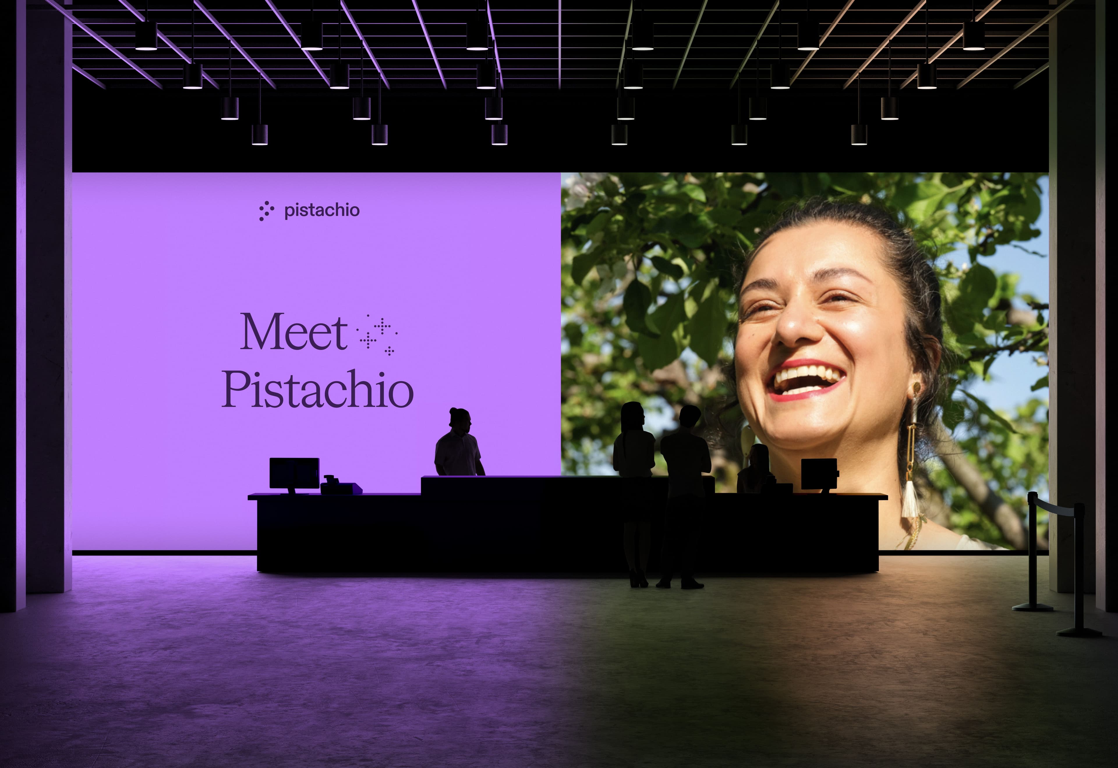
Hierarchy through elevation
Whichever color scheme we are using, an active use of color to emphasize is highly effective, and we use the concept of visual elevation as a starting point: Elements that are closer to you should be perceived as lighter. In example, our default background color is Warm. Modules adhering to the grid can either be set directly onto the warm background, or if of higher importance, have a white background.
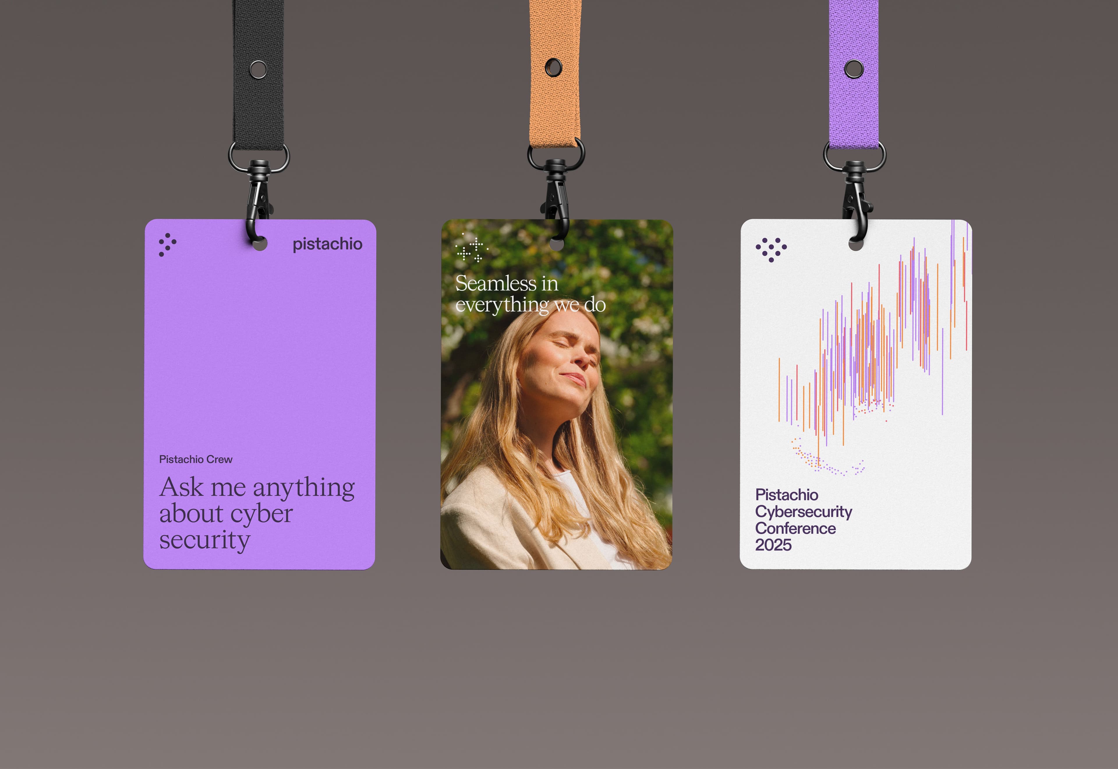
Considered contrasts
Further, when working with typographic layouts, actively using high contrast in type sizes both help create a distinctive look, while also guiding the user's eyes.